- Services
- brand identity
- Sectors
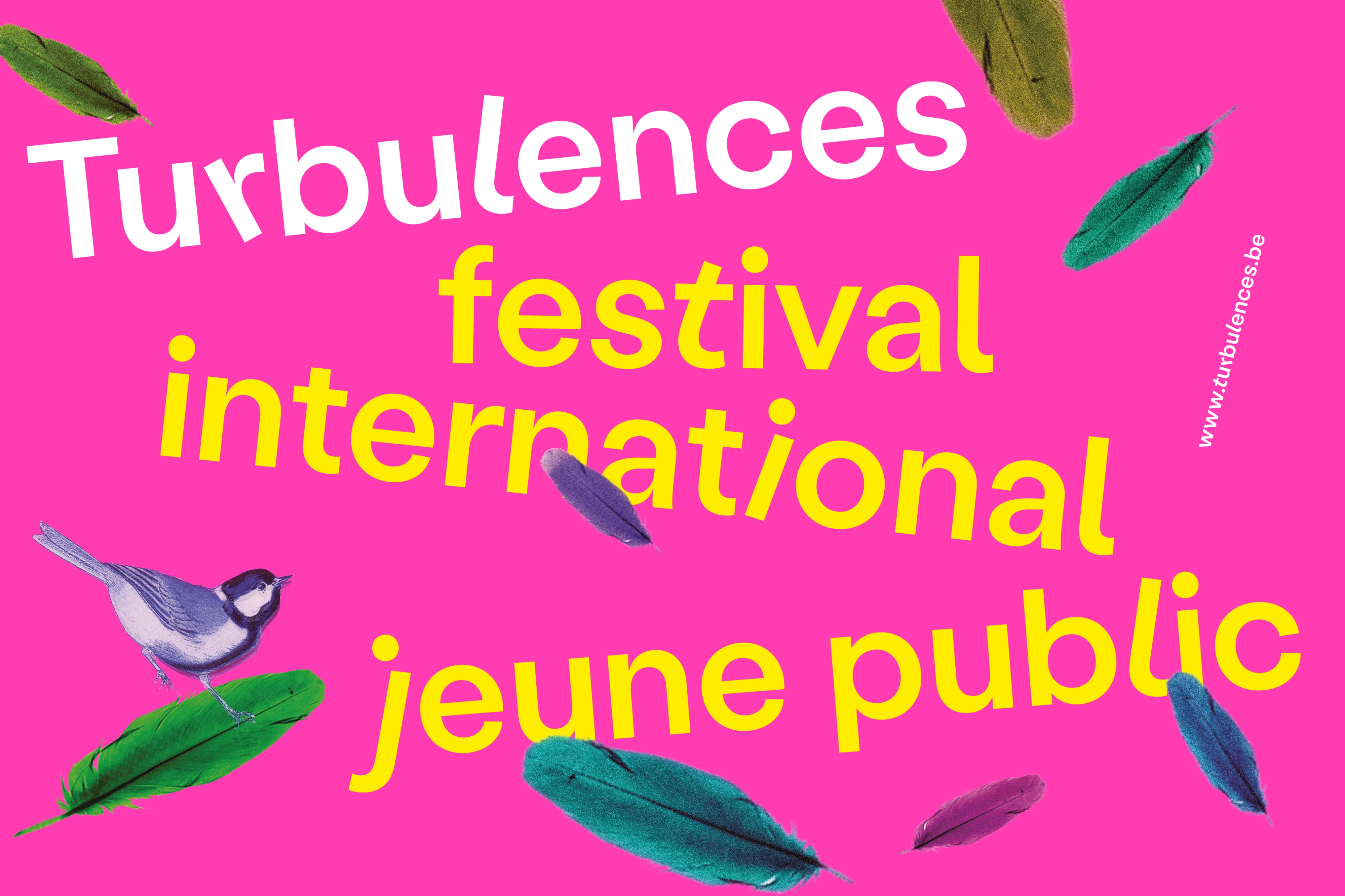
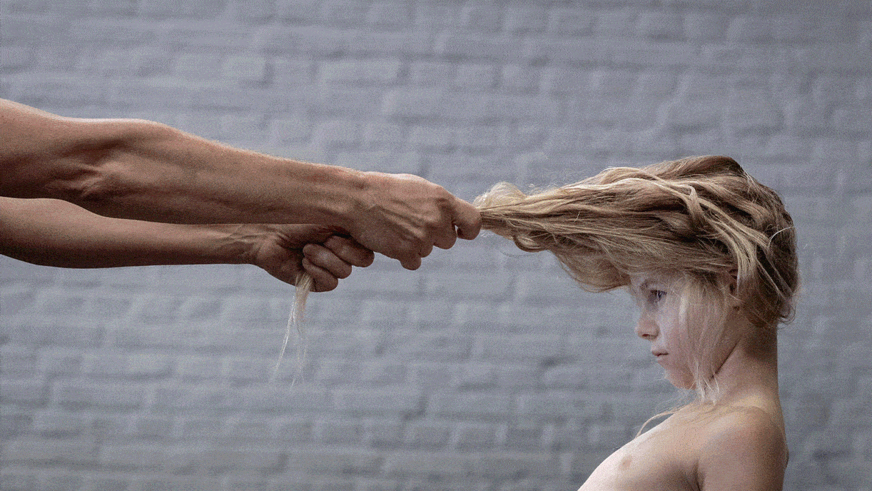
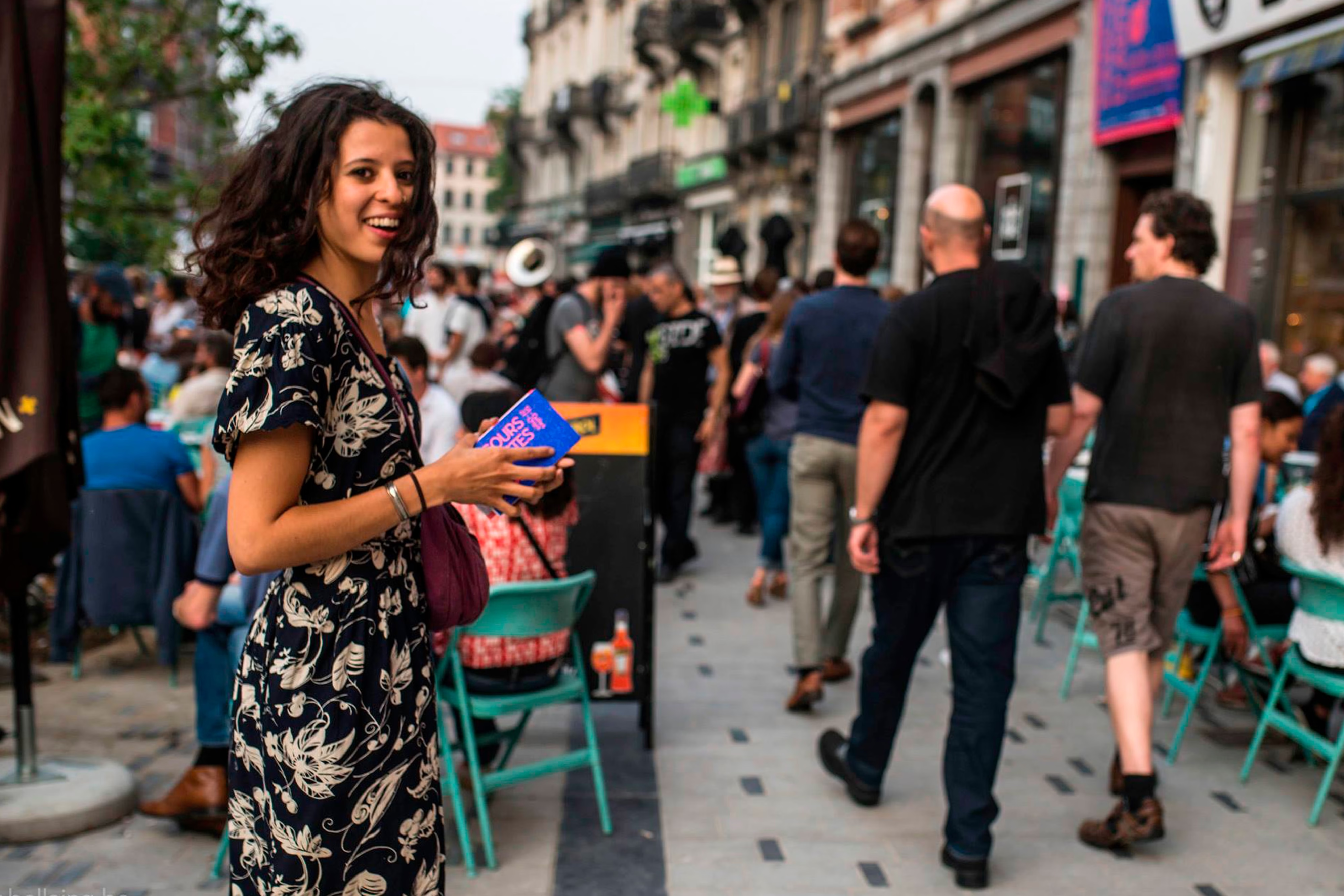
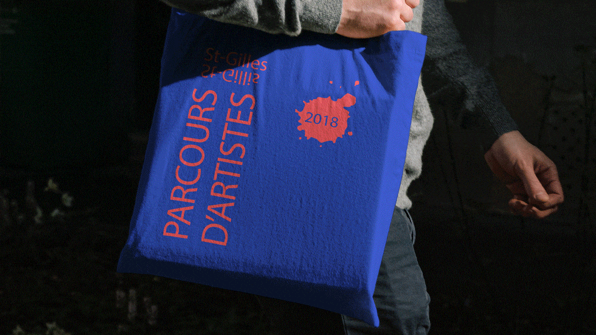
- art & culture, public & institutional, social media Collaborations
the piknik team exclusively
Clients- Municipality of Forest
Brussels is known for its unique linguistic landscape, operating as a bilingual city where public services, municipal structures, and signage are often legally required to appear in both Flemish and French. The same rules applied to our client, the culture bureau of Forest, one of Brussels’ 19 communes. They came to us with the request to design a new bilingual logo for the department a well as easy-to-use templates for all future communiations around cultural activities in the area.
Fully embracing the bilingual nature of the required words, “culture” and “cultuur” we merged the two C’s into a balanced central monogram, forming a circle that creates movement and elegantly integrates the commune’s postcode. This circular cipher also subtly references the copyright © symbol, universally recognized as a sign of culture and intellectual property. Through this thoughtful design, the department’s mission of promoting local art and artists is clearly conveyed in a new, iconic logo that enhances Forest’s cultural identity.
Brussels is known for its unique linguistic landscape, operating as a bilingual city where public services, municipal structures, and signage are legally required to appear in both Flemish and French. The same rules applied to our client, the Culture Bureau of Forest, one of Brussels’ 19 communes, who asked us to design a new bilingual logo and easy-to-use templates for all future cultural communications.
Embracing the bilingual nature of “culture” and “cultuur,” we merged the two C’s into a balanced monogram, forming a circle that integrates the commune’s postcode. This shape also subtly references the © symbol, conveying Forest’s mission to promote local art and artists through an iconic new logo.