- Services
- brand identity, book & editorial design, verbal identity & naming
- Sectors
- art & culture, publishing, architecture & design, retail & services Collaborations
Graphic design with Mathieu Lauwers, production motion design by Pauline Heckmann
Clients- AAC Architecture
AAC ReUse began with a specific request: to give a clear identity to an existing practice within AAC focused on material reuse. The aim was not to introduce new ways of working, but to make visible and legible practices already embedded in ongoing projects.
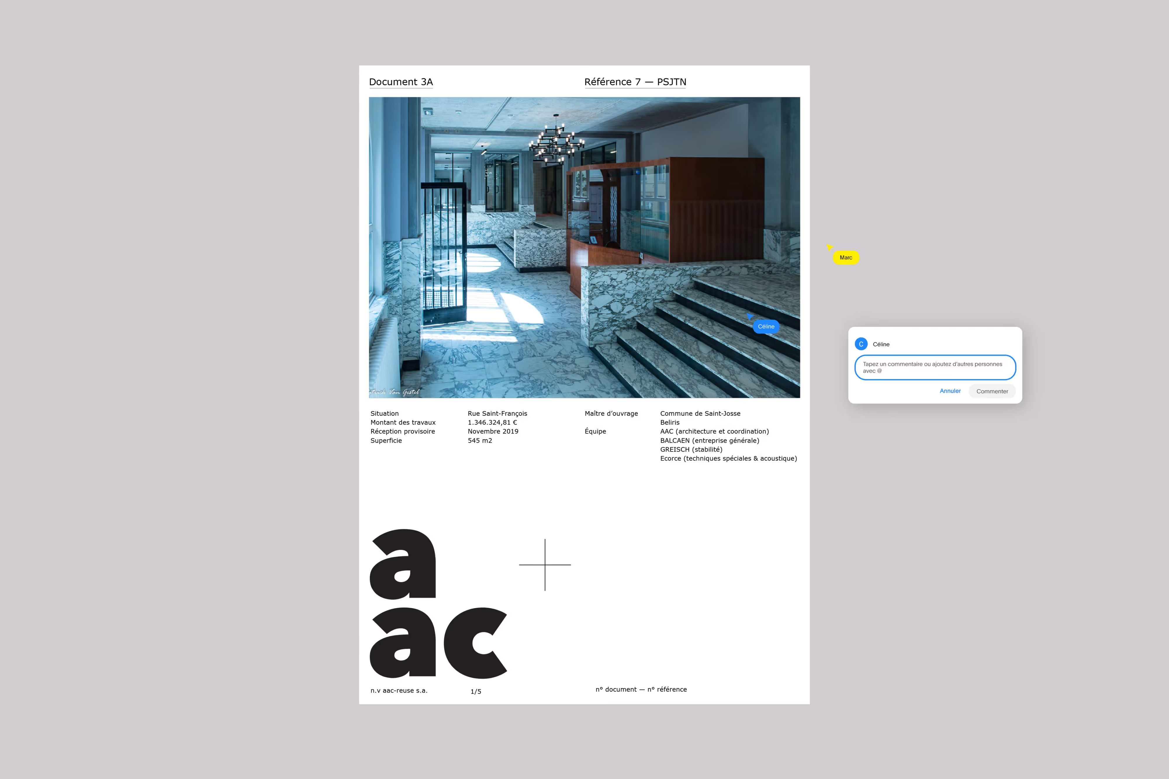
The project builds on the studio’s daily workflow and on a familiar tool shared across the team: Google Docs. A simple tool at first glance, yet one that structures how the team collaborates, writes, reviews and shares documents.
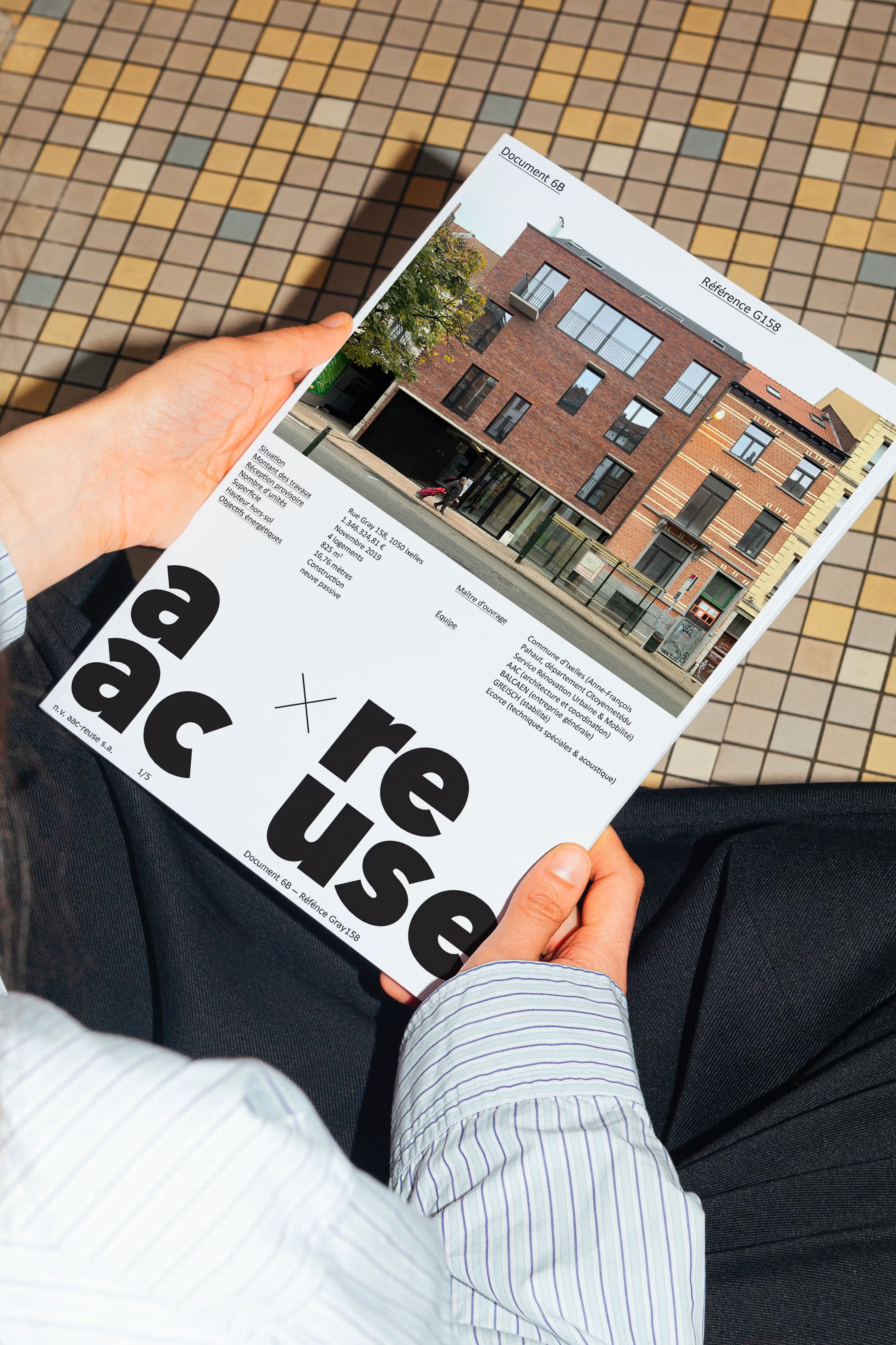
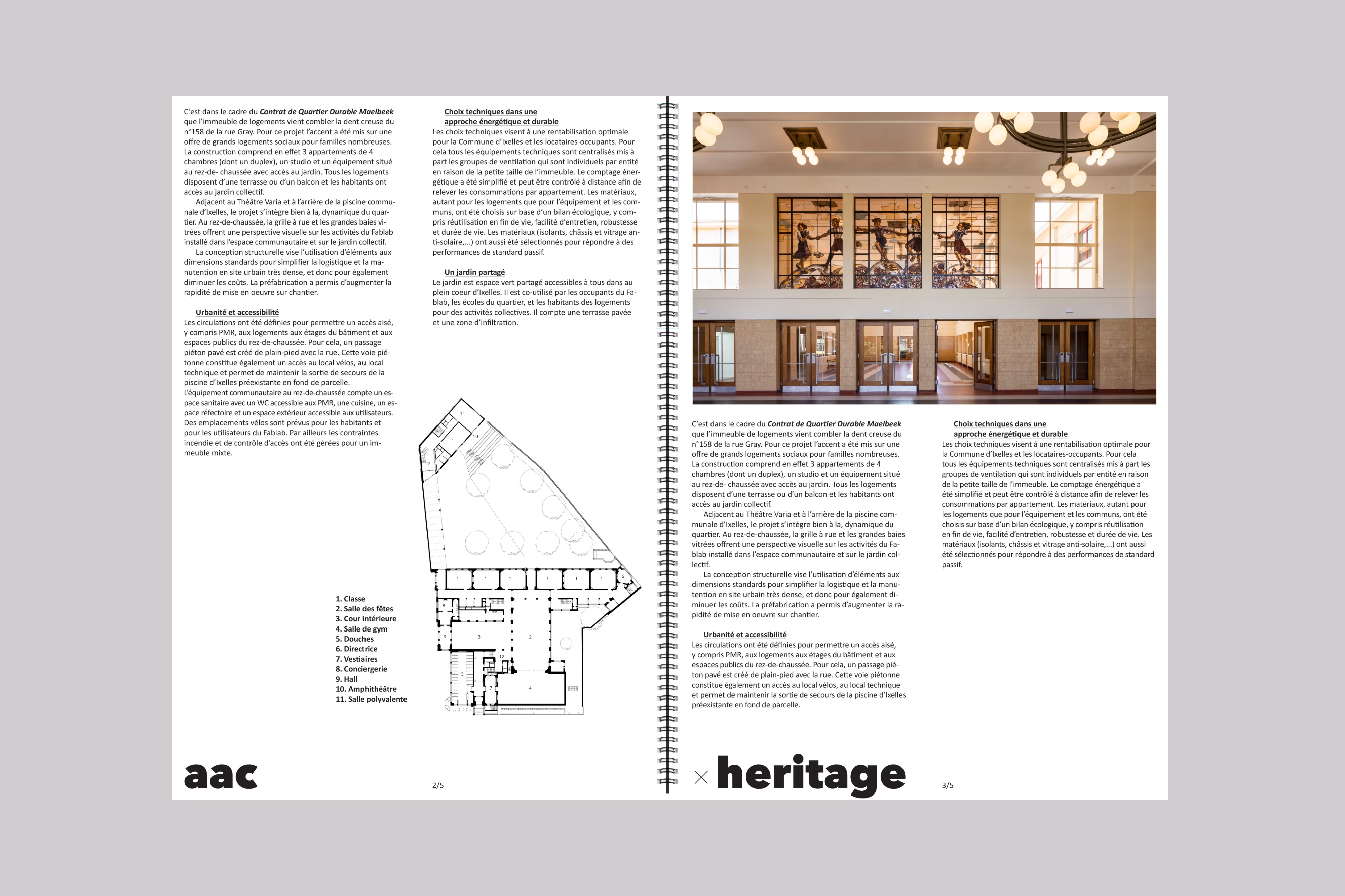
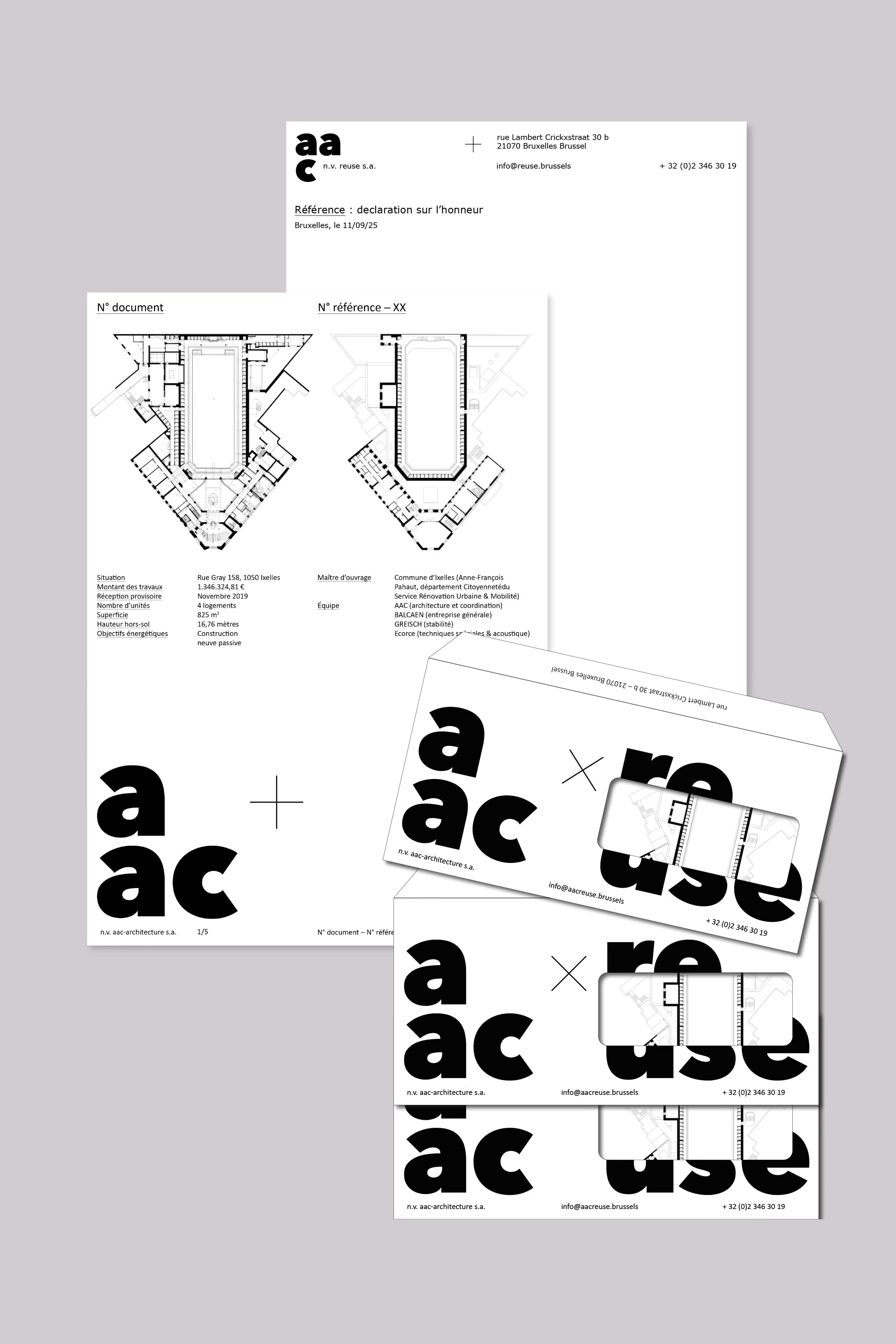
From there, a graphic language was developed using the typefaces directly available in Google Docs together with layouts created specifically for the project. A lightweight system designed to support the content and easy for the team to work with from the start. The documents remain central, while a clear and recognisable visual consistency runs throughout.
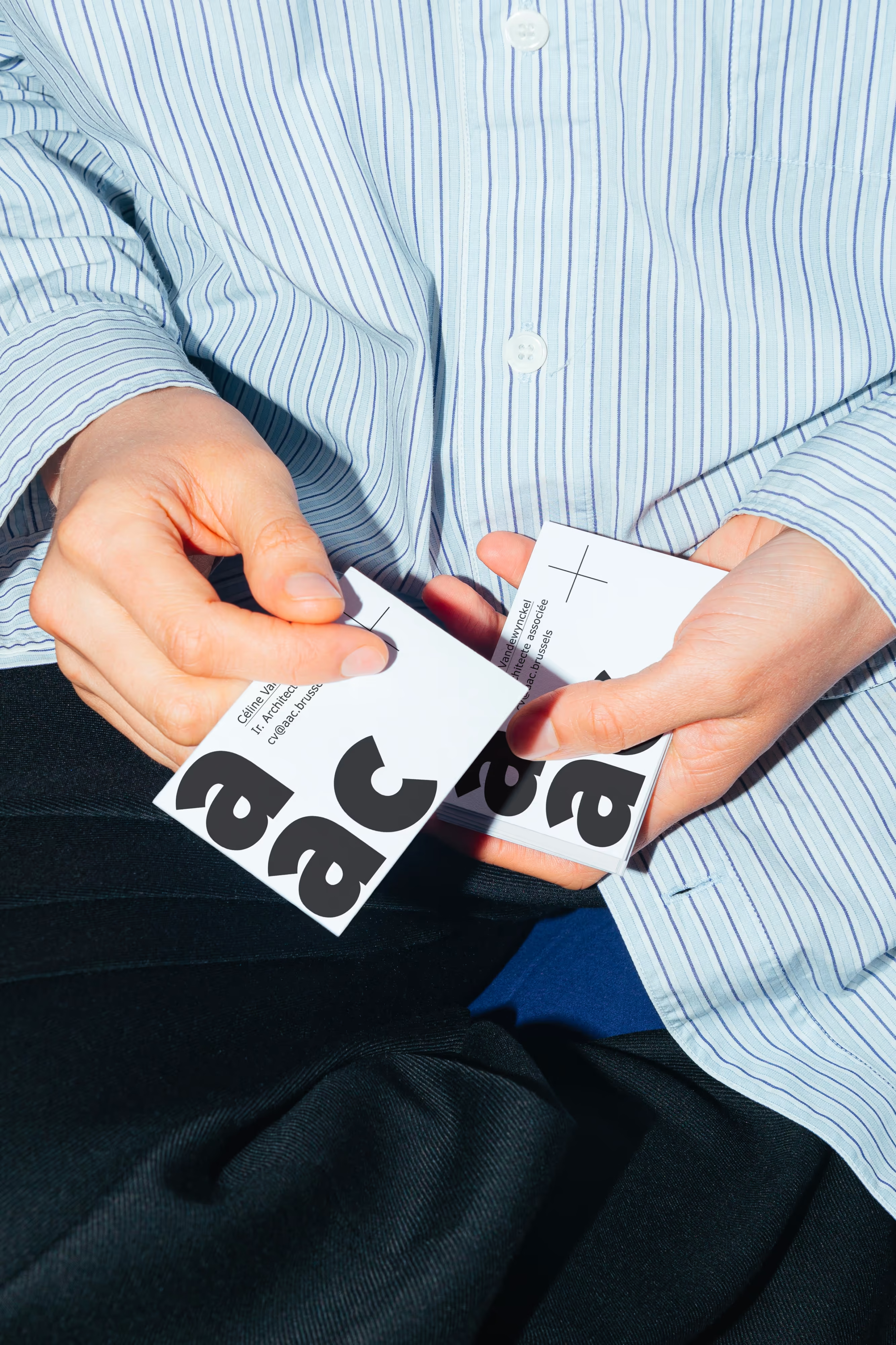
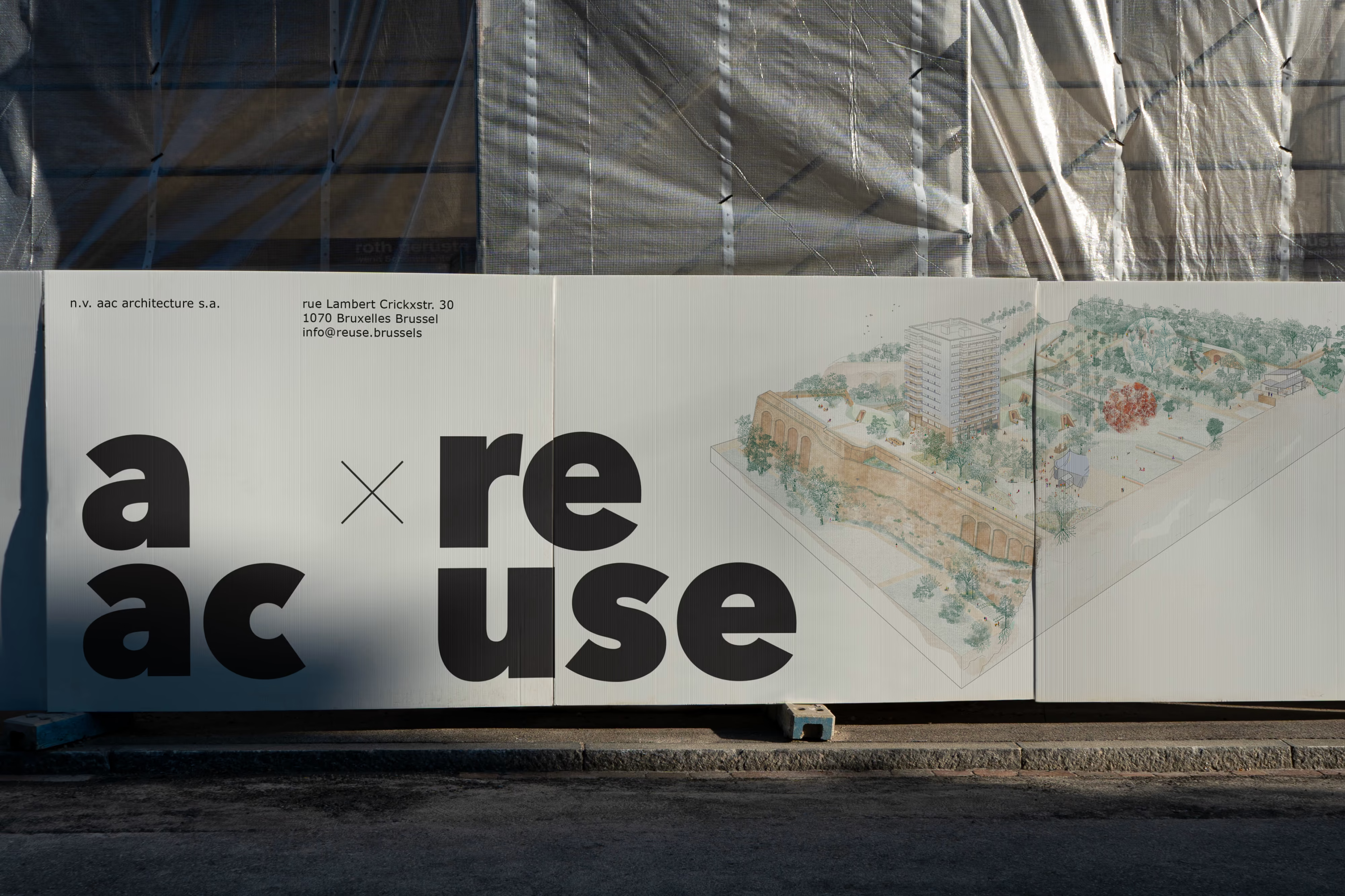
Within this framework, connections begin to appear between practices already present across the office. Reuse becomes one entry point among others into a broader reading of how AAC approaches architecture. AAC+ extends that reflection while remaining closely connected to the office’s existing identity and structure. The “+” simply points to the different practices already part of AAC and brings them together within one shared visual language. The different areas unfold as extensions of the same foundation: AAC x ReUse, AAC x Heritage, AAC x InUse, AAC x Rebuild and AAC x Outdoor. Each retains its own focus while remaining part of a coherent whole.
AAC+ does not propose a new image for the office. It offers a way to make visible the range of practices that already define AAC and contribute to what makes the studio distinctive.
AAC ReUse began with a clear request: to create an identity for an existing practice within AAC focused on material reuse. The aim was not to invent something new, but to make existing work more visible and easier to read. The project is rooted in the studio’s day-to-day workflow and in a shared tool: Google Docs, a simple platform that shapes how the team collaborates, writes, reviews and shares documents.
From there, a graphic language was developed using typefaces available in Google Docs and layouts designed for the project. A lightweight system made to support content while remaining easy to use. Reuse then became an entry point into a broader reading of the office. AAC+ extends this logic, bringing AAC’s different practices together through one shared language, without redefining the studio but by making more visible what already shapes its identity.